

Christmas Campaign


Loyalty App
Avalanche Foundation Intiative
Creative Studio
ICC CHAMPIONS Trophy 2025
Design System
Logo Collection

Senior Product Designer, Brand Designer & Creative Developer based in Hamburg, Germany.
What I do
Since 2017, I’ve been working alongside businesses worldwide. I envision, design, develop and consult. A clear focus on product-oriented needs, data, usability standards and an eye for beautiful UI.
My Journey
Besides being a freelancer, I work alongside agencies to combine creative forces for business needs. Always open to new collaborations.
Founder & Creative Director
Izel Collective (prev. TLK Design)
Mar 2017 - Present
Senior Product Designer
Insomnia Labs
Feb 2025 - Mar 2026
Product Designer
Insomnia Labs
Oct 2022 - Feb 2025
Junior Art Director
Ballyhoo
Jun 2021 - Jan 2024
Apprenticeship - Media Designer Digital & Print
bmk Berufsschule Hamburg
2018 - 2021
Brands I've worked with


Impressum
Timo Leon Krause
Ehrenbergstraße 51
22767 Hamburg
inquiry@tlk.hamburg

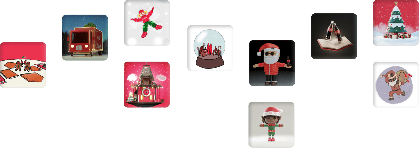
Christmas Campaign
Client
Coca-Cola
Region
Latin America
Role
UI/UX Design
Year
2022

Introduction
Coca-Cola fans from Latin America had the opportunity to claim one of ten meticulously crafted NFTs, with an added chance to secure a high-value NFT from one of our four esteemed partners in the campaign.
This campaign was part of the “Real Magic” christmas campaign that’s played across the globe. This particular part of the campaign was limited to LATAM.
01
Impact & Results
This campaign proved to be a resounding success, as Insomnia Labs and all partners seamlessly guided Coca-Cola into the world of crypto and NFTs. The collaboration was so impactful that it led to another partnership on a subsequent campaign.
02
How did I design an experience that reflects the warmth and festive emotion people associate with Coca-Cola, especially in the context of Christmas?
My approach reimagined the interface through the lens of the iconic Coca-Cola vending machine. The UI and interactions draw on the familiarity and emotional appeal of classic Coke machines, reinforcing the campaign narrative: use the Metaverse Vending Machine and receive a reward, just like purchasing a bottle of Coke.
To bring this concept to life, I designed a fully responsive, vector-based vending machine that anchors the web experience. Subtle interactivity and the animated “magic gift box” add anticipation and delight, making the campaign both emotional and unmistakably on-brand.


03
The minting flow
The minting flow itself is intentionally lightweight and friction-aware. Upon landing, users complete an age verification step to meet legal requirements, followed by a simple Web3 wallet connection to enable the NFT to reach the users’ wallet.
Once the user clicks “Mint” the vending machine animates and presents the gift box reveal, clearly communicating the reward moment and showcasing the specific NFT the user has received.

Next Project

Loyalty App
Client
Chubby Group
Region
United States
Role
Lead Product Design
Year
2025

Introduction & Problem
Chubby Club serves as the digital hub for Chubby Group's high-end US restaurants. The app streamlines dining discovery, points collection, rewards, and tiered membership benefits.
The core issue with the existing loyalty app was a lack of clarity around user value. Customers struggled to understand which benefits they had access to, what incremental value paid memberships delivered, and how content was structured. As a result, the app felt optional rather than an integral companion to the dining experience at Chubby’s locations.
In addition, the rewards system was operationally fragile. Redemptions weren’t automatically tracked or tied to verified visits, relying instead on manual input from staff. This introduced opportunities for fraud and misuse, limited customer visibility into what had been redeemed and when, and created unnecessary friction for servers who had to validate rewards manually—ultimately increasing service time and degrading the in-store experience.
01
Impact
We conducted a controlled test run for the new app by giving 100 users and 5 selected restaurants access to the new app for one month before official release to get real insights and trends. 70 users were not paying for any membership before, 20 were ONE members (Mid-Tier) and 10 were PLUS members (Highest Tier).
After the test, we surveyed the users and also some servers that worked in the 5 selected restaurants to get additional metrics besides the ones we were able to conduct through analytics tools in the app.
Additionally the redesign has been shared with their community to gather direct feedback from the people that use it on the regular on their flourishing Discord server.
After the test and based on the feedback from Discord; The new app design brings clarity, reducing friction for users. It also increases conversion due to efficient non-disturbing placements and teasers for the paid memberships, aswell as the Lifetime Passes that bring permanent value.
02
How did I redefine Chubby Clubs’ brand identity based on their playful yet elegant nature?
Chubby Clubs’ previous brand identity was sparse and inconsistent. Their promotional landing page had a complete different design language than the existing old application.
I created a scalable design system in Figma that defines and documents Chubby Clubs’ design language and its components. I picked up their playful idea of having a mascot – the expressive ramen bowl – and combined it with an elegant and modern UI – primarily in dark mode. The design system also includes a fully working light mode that is set up with variable themes.


03
How did I eliminate the key UX issue from the old app?
Users on Discord regularly mentioned on major issue; The display of the users’ benefits. They were scattered across the app, making it hard to see all benefits in one place.
Therefore I chose to consolidate the Home & Explore Page – making the Home Page the new main hub for discovering – while allowing space for a new easy-to-access page called “My Benefits”. It streamlines all three kinds of benefits and makes it easy to learn more about them while educating about the next tiers’ benefits, the paid memberships and the Lifetime Passes – aswell as allowing Chubby Club to upsell their memberships in a non-aggressive way.
This solves multiple issues at once. One central place for all your benefits that are accessible while being able to increase conversion rate by teasing what a membership upgrade or Lifetime Pass offers.

04
Clarifying Tier Progress vs. Spendable Points & Consolidating History for Transparency and Control
Tier Progress represents points earned exclusively through dining activity and serves as an indicator of membership status. These points are non-spendable and remain unaffected when users redeem rewards. In contrast, Spendable Points function as a usable balance that can be redeemed for rewards.
The previous app did not clearly communicate the distinction between Tier Progress and Spendable Points, resulting in frequent confusion—particularly among new users, as reflected in community discussions on Discord. To address this, I introduced contextual information icons directly within the interface. These icons clearly signal that additional details are available and allow users to access explanatory content on demand, improving clarity without adding visual clutter.
The legacy app also lacked a centralized history view, making it difficult for users to track their past activity. I designed a unified history section that consolidates all relevant actions—including dining visits, reward claims, redemptions, and membership benefits—into a single, structured timeline.
To improve usability and transparency, I introduced quality-of-life enhancements such as clear redemption status indicators, allowing users to instantly see whether a reward has been redeemed. Each history entry is interactive and provides detailed information when selected, enabling users to easily review and understand their activity. This created a more transparent, intuitive, and trustworthy experience.

05
Simplifying Discovery
The previous map experience was sluggish and lacked alternative browsing methods, forcing users to rely solely on map interactions to discover restaurants. This created friction for users who preferred scanning options more efficiently or comparing multiple venues at once.
To address this, I redesigned the discovery experience by optimizing map performance and introducing a complementary list view. The list view provided a faster, more structured way to browse nearby restaurants, enabling users to quickly scan, compare, and select options without relying exclusively on map navigation.
I also introduced advanced filtering capabilities, allowing users to refine results based on cuisine, distance, price range, and real-time availability (open status). These filters gave users greater control and significantly reduced the effort required to find relevant options.
These improvements led to a measurable increase in discovery engagement and overall feature usage during the test phase, validating the effectiveness of the redesigned experience.

06
Enhancing Reward Visibility and Understanding
The previous Rewards page lacked visual prominence and was easy to overlook, resulting in low discoverability and limited user engagement. It also did not provide a clear overview of previously claimed or active rewards, making it difficult for users to track and understand their benefits.
I redesigned the Rewards experience to improve visibility, structure, and clarity. The new layout provides a clear overview of both available and previously claimed rewards, helping users better understand their reward status at a glance.
To address confusion between “Active Rewards” and “Available Rewards,” I introduced educational modals that explain the distinction in context. This was a significant improvement over the legacy experience, which offered no guidance. Users can now proactively claim rewards using their points before visiting a restaurant—particularly important for offers that are limited by quantity or time. This not only improved clarity but also introduced a sense of urgency and anticipation, encouraging users to check the app more frequently and engage more actively with available offers.

07
Creating a More Personalized and Engaging Account Experience
The previous Account page relied on a simple, text-based list structure, which lacked visual hierarchy and made it difficult for users to quickly locate important information or features. The experience felt purely functional and did not reflect the value of the user’s membership or progress.
I redesigned the page using a modular “bento” layout, introducing a more dynamic and structured overview of key areas such as membership status, rewards, settings, and exclusive benefits. This approach improved information hierarchy, scannability, and overall engagement, transforming the Account page into a true dashboard rather than a static settings list.
To further enhance personalization, I introduced a prominent display of user tags, reinforcing each user’s identity, achievements, and membership status. This helped create a stronger sense of ownership and emotional connection with the product.
The redesign also improved the visibility of high-value features, contributing to a 46% increase in click-through rate to Lifetime Passes during the test phase, demonstrating the effectiveness of the new layout in driving feature discovery and engagement.

08
User Validation
The app is still in development as of now. Previously the client shared key user interfaces with their active discord server to get feedback as the majority of their members use the app religiously and the app obviously needs to cater to them.
The feedback was extremely positive. Users appreciated the new structure and the refined benefits page, aswell as the overhauled and visually aesthetic design language – especially the new cute ramen bowl mascot.
“I really like how polished the new design is. The new ramen buddy is SO CUTE!”
Sep 17, 2026 - 8:01PM
“that’s actually so good, love how all my benefits will be in one place”
Sep 17, 2026 - 7:34PM
“first of all: the ramen bowl is super cute! The new design looks super crisp”
Sep 18, 2026 - 5:03PM
09
Designing a Secure and Efficient Server Redemption Flow
Servers operate from a single, centralized account within the main application, with the ability to toggle between Server Mode for operational tasks and Patron Mode for customer loyalty features. This unified structure allows staff to seamlessly manage customer interactions without requiring separate systems or devices.
Together with the Project Manager and Tech Lead, we crafted dedicated workflows that enable servers to scan a customer’s QR code or manually check them in, instantly accessing their loyalty profile. From there, servers can securely redeem rewards on the customer’s behalf, ensuring a smooth and efficient in-restaurant experience.
This replaced the previous manual process, where servers relied on customers to present rewards on their own devices. In high-pressure service environments, this approach introduced significant fraud risk, as staff had limited ability to verify whether a reward had already been redeemed or if the screen had been manipulated. The lack of reliable validation created both operational friction and potential revenue loss.
The redesigned flow fully automated reward verification and redemption. Servers can now view real-time reward eligibility directly within the system, eliminating ambiguity and removing reliance on manual visual confirmation. This significantly reduced fraud potential, improved staff confidence, and streamlined the redemption process, creating a faster, more secure, and more trustworthy experience for both staff and customers.


10
Reimagining Dashboards with Role-Based Clarity and Focus
The legacy dashboards for Location Managers, Group Managers, and Executives were overly complex and cluttered with features irrelevant to each user’s responsibilities. This lack of focus created cognitive overload, reduced efficiency, and made it difficult for stakeholders to access the information and tools they needed most.
I redesigned the dashboard architecture around role-based access and relevance. Each user now receives a tailored dashboard experience aligned with their specific responsibilities, goals, and decision-making needs. This ensures that users only see actionable information and features that are directly relevant to their role.
By removing inaccessible or irrelevant functionality—such as admin-only features visible but not usable by other roles—I reduced visual noise and frustration while improving clarity and usability. This resulted in a more focused, efficient, and intuitive dashboard experience that empowers each stakeholder group to operate more effectively.

Next Project
Avalanche Foundation Initiative
Client
Avalanche
Role
Product Design
Year
2023
Visit
retro9000.avax

Introduction
In 2023, Avalanche reached out to Insomnia Labs about building a $40M grant initiative from the Avalanche Foundation, rewarding builders and referrers who are driving real impact onchain.
I served as the primary product designer, collaborating with the Lead Designer for periodic quality reviews and alignment.
01
Impact
02
Designing for Builders and the Avalanche Community
Retro9000 needed to serve two core audiences with distinct needs: developers submitting projects and community members discovering and supporting them. Builders required a frictionless way to submit, present, and track their projects, while enthusiasts needed intuitive tools to explore, evaluate, and vote across the ecosystem.
I designed a unified experience that supports both contribution and discovery without fragmenting the product. Structured submission flows, clear status feedback, and seamless wallet interactions reduced friction for developers and encouraged participation. At the same time, discovery-focused features such as project listings, leaderboards, and voting made it easy for the community to engage and influence outcomes.
By balancing these two perspectives, Retro9000 became more than a submission platform—it evolved into an ecosystem hub that empowers builders with visibility while enabling the community to actively participate in shaping Avalanche’s growth.
03
Seamless Project Submission
Submitting a project had to feel effortless despite the amount of required information. I designed a multi-step flow that breaks complexity into manageable steps and automatically saves drafts. This allows developers to pause and resume at any time without losing progress, reducing drop-off and cognitive load.

04
Exploration and Voting Designed for Control and Transparency
The Discover experience was designed for fast, flexible exploration, allowing users to quickly find relevant projects through search, round selection, and multi-dimensional filters. Given the Avalanche community’s technical sophistication, I prioritized information richness and clarity, enabling users to evaluate projects with confidence rather than oversimplifying key details.
Voting was built around a structured ballot system that gives users full control over how they allocate their votes. Users can distribute votes across multiple projects and review a clear ballot overview before confirming. This overview makes it easy to adjust allocations and confirm votes round by round, supporting thoughtful decision-making without forcing users to complete everything in a single session. Once confirmed, votes are locked to ensure integrity and prevent manipulation.
To support seamless navigation, I introduced a persistent round selector that allows users to quickly switch between active rounds. This enables efficient comparison and participation across multiple funding tracks, reinforcing continuous engagement and empowering users to actively shape ecosystem outcomes.

05
Increasing Engagement Through Leaderboards and Live Activity
Leaderboards were designed to surface top-performing projects, creating visibility, motivation, and a sense of competitive progress. This encouraged builders to actively improve their standing while helping the community quickly identify impactful projects.
The live activity feed complemented this by providing real-time visibility into submissions, votes, and ecosystem activity. By continuously highlighting what’s happening across rounds and categories, it reinforced momentum, encouraged repeat visits, and strengthened ongoing participation within the platform.

Next Project
Creative Studio
Client
NewKino Studio
Role
Brand Identity,
UI/UX & Dev.
Year
2023
Visit
newkino.studio
Introduction
NewKino is a nimble creative studio that brings impossible worlds to life. Founded in 2020 by a collective of filmmakers and technologists, NK builds the next evolution of award-winning visual stroytelling.
01
The Challenge
Craft a sophisticated and timeless brand identity. Tranform this identity into a distinctive and visually captivating website that showcases the exceptional work of NewKino.
NewKinos’ work should be the primary focus at all times, with the remaining UI complimenting that endeavor.
02
The Brand Identity
Recognizing that brand identity is the cornerstone of any enterprise, I crafted a comprehensive visual system for NewKino. This process included designing a bespoke logo and curating a refined color palette and typography suite to ensure a cohesive, elegant, and professional aesthetic across all touchpoints.
The logo communicates innovation and modernity. Its dynamic mark conveys forward motion and cinematic energy, visually expressing NewKino Studios’ progressive, video-first identity.

03
The Home Page
The homepage acts as the studio’s digital threshold, anchored by a prominent showreel. We utilized a minimalist UI to minimize distraction, ensuring the creative work takes center stage. The content strategy is precise: a curated Featured Projects slider, Key Services, and a glimpse into the Team page.

04
The Projects
The projects page offers a dual-view experience: expansive, full-width imagery for deep immersion, and a condensed grid view that allows users to scan multiple projects simultaneously with ease. Large imagery keeps the focus on the work itself.

05
The Project
Each case study provides a comprehensive deep-dive, blending key information with high-fidelity images and video to fully articulate the project's narrative.

06
The Team
I reimagined the standard team directory with interactive, holographic-style cards. This design nods to modern collectible culture, offering a distinctive and high-value presentation for every member of the studio.

Next Project
ICC CHAMPIONS Trophy 2025
Client
ICC
Region
Global
Role
UI/UX Design
Year
2025

Introduction
A fan experience inspired by Spotify Wrapped, designed to give cricket enthusiasts a personalized recap of their statistics and standout moments from interacting with the various games tied to the CHAMPIONS Trophy 2025 in Pakistan.
01
Impact & Results
02
The Challenge
The goal was to create an engaging, user-friendly journey that evokes excitement, nostalgia, and a sense of achievement — while remaining closely aligned with the tournament’s brand identity to ensure consistency and memorability across all touchpoints.
Main focus is on the easy to use navigation; Simple arrows to move back and forth between the slides – aswell as a centric share button to incentivize sharing the campaign to social media.

03
AI Leverage
Each fan received an unique recap, featuring individualized color schemes and tailored statistics that reflect their personal performance and engagement.

Next Project
Design System
Role
System Design
Year
2025
Visit
figma.com


Introduction
KHAOS is a flexible design system that simplifies the creation of modern, visually refined interfaces. It isn’t meant to be a universal solution, but rather a source of inspiration and a demonstration of my skillset.


01
What makes a Design System scalable?
Global variables, structured color styles, and fully flexible components that can switch between light and dark modes instantly using Variable Modes. All of these parts ensure the design system is easy to adapt, scalable to all extents.

02
UI Components
KHAOS includes a wide range of ready-to-use UI components — such as tables, modals, and more — and continues to grow as I expand it over time.

Next Project
Logo Collection
Clients
Multiple
Year
2018 - 2025

Introduction
Over the years, I’ve had extensive opportunities to create pictorial marks and develop complete brand identities. To keep this collection focused, I’ve chosen not to include full brand identities but instead highlight only the pictorials — showcasing both my skillset & stylistic range.


Next Project